Meeples

UX Audit • Redesign • Personal Project • E-Commerce

The challenge

Meeples is an e-commerce store selling board & card games. A clear, simple and reassuring purchase process is vital to conversion which is an area Meeples is severely laking in.

The goal of this particular project was to improve the overall purchase process by conducting a UX audit based on Baymard institute’s research guidelines.

Timeline

Nov 2022, 1 month

Role

UX audit, Wireframes, High-fidelity prototypes

Tools

Figma, Adobe Illustrator

Useful links

Information gathering

The first task was to review the existing purchasing process and collecting screenshots of all possible journeys. Then, I conducted a detailed audit primarily based on Baymard Institute’s research guidelines. The audit focus areas included the product lists and filtering, product details page and, cart and checkout. The audit allowed me to identify and prioritise areas of improvement.

Some general issues I noticed are that the website is not mobile responsive and has a dated look and feel. I have elaborated other issues in regards to Baymard guidelines in the following sections.

UX audit key takeaways

Product Lists & Filtering

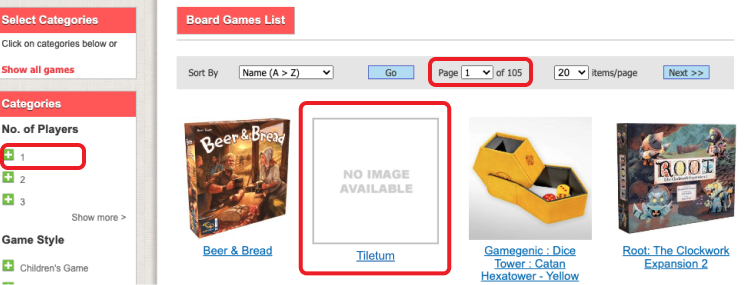
🤔 Filtering requires a lot of guessing

The use of novel plus icon in combination with the lack of number of matches for each filtering options will not only make users wonders if filters can be combined but also the usefuleness of each filter.

⭐ Important filter types are absent

Arguably one of the most common e-commerce filter type, “Price”, is missing. Additionaly, “User Ratings”, “Product Status” and “Sales” filter type are also missing.

ℹ️ Product list item is incomplete

Essential product information such as price, user rating and product type is missing. Some product list items don’t have thumbnails which signifies to many users that a product is incomplete.

🧭 Pagination tends to be problematic

Pagination is generally perceived to be slow and users browse much less of the total product list as it requires multiple page reloads. It’s also difficult to compare products across multiple pages.

Screenshot of a portion of the product list highlighting some of the issues

UX audit key takeaways

Product Details Page

ℹ️ Not enough information to evaluate a product

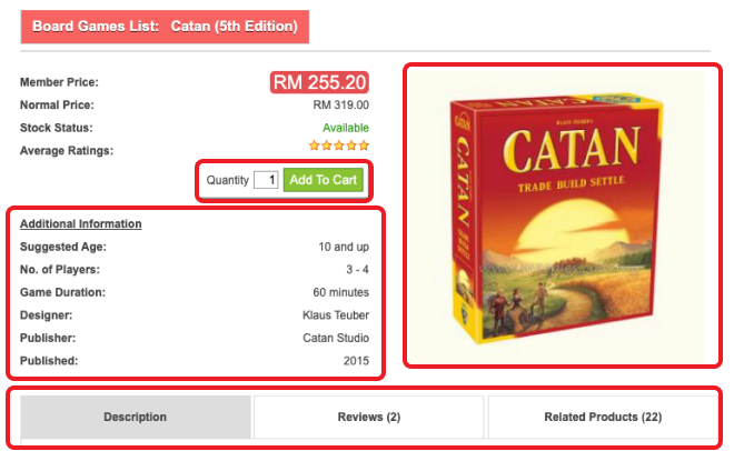
Each product has one image or none at all and, delivery related details such as esimated delivery date and free shipping information is missing.

🛍️ Too many distractions in the “Buy” section

Granular details such as product specficiations take up room in the “Buy” section. Additonally, quantity fields are nothing but clutter for items such as board games, which are usually bought in single quantity.

🗂️ Horizontal tabs are easily overlooked

27%1 of users overlook the hidden content in horizontal tabs which may result in users assuming that the product information is incomplete.

🍞 Users may feel lost due to abscense of breadcrumbs

Without breadcrumbs, users have trouble finding related products and understanding the site hierarchy.

Screenshot of a portion of the product details page highlighting some of the issues

UX audit key takeaways

Cart & Checkout

🛒 Difficult to update cart quantity

Users will often overlook the "Update" button which is required to save quantity changes. Open text fields are prone to error and can slow users’ process of updating their cart.

🔖 No way to save items in the cart

If there are some items in the cart that users are ready to purchase, the items that they aren’t ready to purchase must be deleted if there’s no way to save them.

📍 Cart link is difficult to locate

Text-only cart link which is not placed in the upper right corner of the interface is prone to be overlooked.

👣 Checkout steps are missing

Users are only provided information regarding current step and not the following steps which may result in users becoming confused or lost.

🍭 Checkout is cluttered

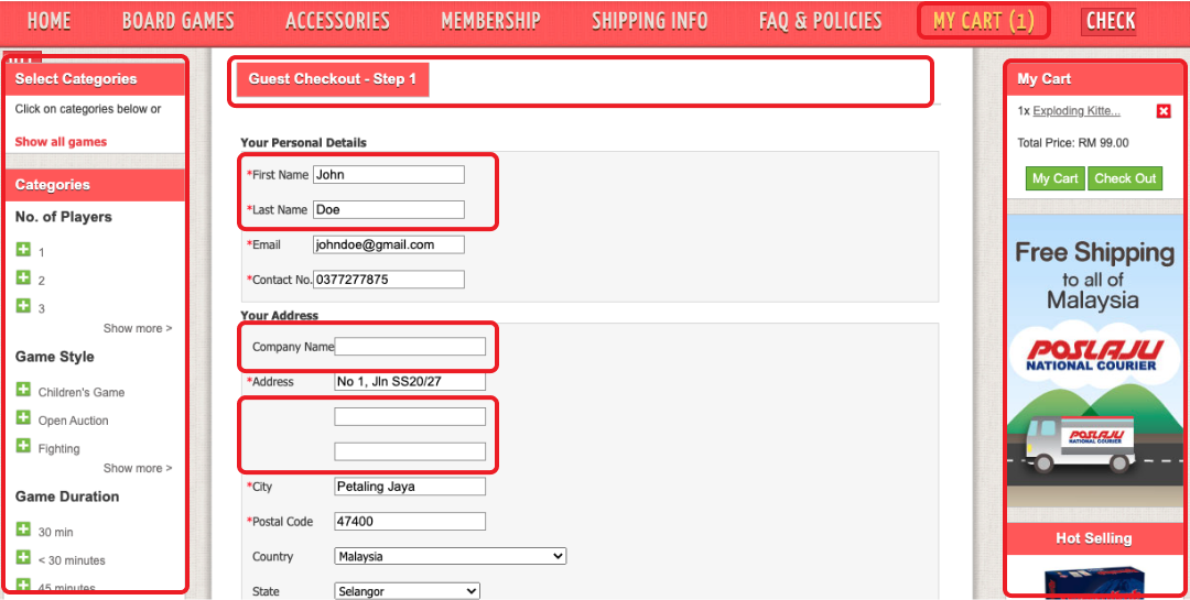
Dominant non-checkout elements such as the main site navigation and filtering sidebar can be distracting to users in the checkout process.

🐳 Overwhelming amount of form fields

Unnessary form fields such as seperate first and last name, multiple address lines and company can result in users feeling intimidated.

Screenshot of a portion of the checkout page highlighting some of the issues

The redesign

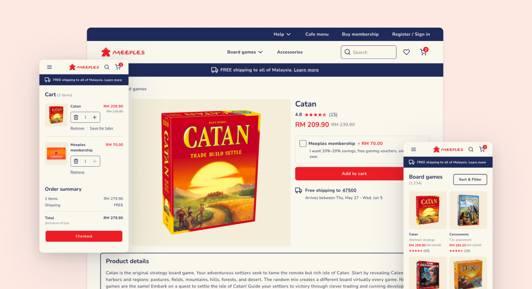
After defining the main issue areas with the help of the audit, I started off with the redesign process. I created an information architecture to properly structure the website followed by low-fidelity wireframes. For the look and feel of the website, I wanted it to be playful and retro. After picking out the fonts and color scheme of the website, I created the final prototype.

Redesign highlights

A filtering interface with no guesswork

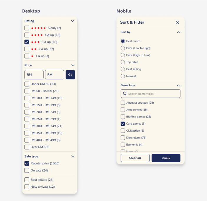
I replaced plus icon with checkboxes for filters so that users don’t have to wonder if filters are combinable. Additionally, number of results for each filter has also been appended so that users can know, preemptively, the effect of applying each filter.

Absent filter types such as user ratings, price, sale type and deals have been included for a comprehensive filtering experience.

Filter types with more than 15 filters also has a search feature for users ease of finding suitable filters quickly.

As for the logic of applying filter, multiple filter can be combined and product list is live updated as filters are applied on desktop while on mobile, users have to tap “Apply” to apply selected filters.

Redesign highlights

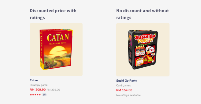
Product list items that are complete

Essential product information such as price, user rating and product type has been added.

It’s recommended to include product thumbnails for all products or at the very least, have thumbnails for the most popular products.

Redesign highlights

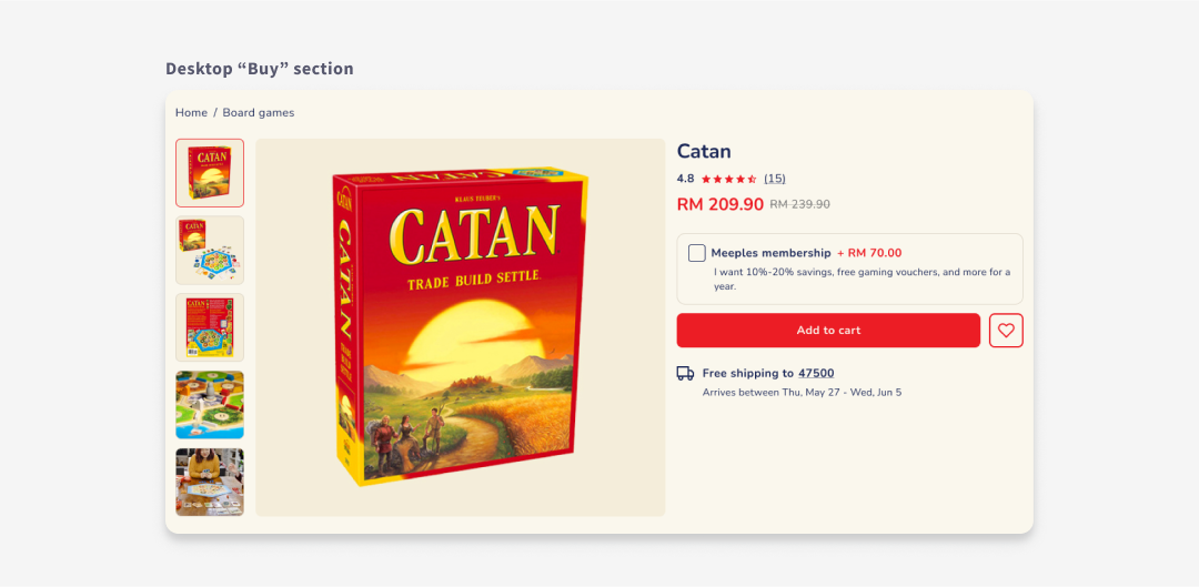
A focused “Buy” section

To help users focus on adding a product to their cart, only essential information such as product name, price and ratings summary are included in the price section.

Instead of having member price upfront, which maybe confused as general discounted price, an optional membership upsell has been added to keep business needs in mind while reducing pricing ambiguity.

An image gallery with product thumbnails for navigation has also been added as opposed to just one image so that user can get sufficient visual information to make a purchasing decision.

Breadcrumbs have been added at the top of the product details page, so that users can instantly know where they are in the site hierarchy and access adjacent pages quickly.

Free shipping information has been added near the “Buy” section to enable users to claerly know about the total order cost.

Redesign highlights

Easy cart management

Cart quantity is autoupdated as users clicks “+” or “-”. Open text field is done away with to avoid human errors.

Users can also conveniently save items that they don’t want to purchase right away. Saved for later section can be found below cart items along with options to move an item back to cart or remove it entirely.

Redesign highlights

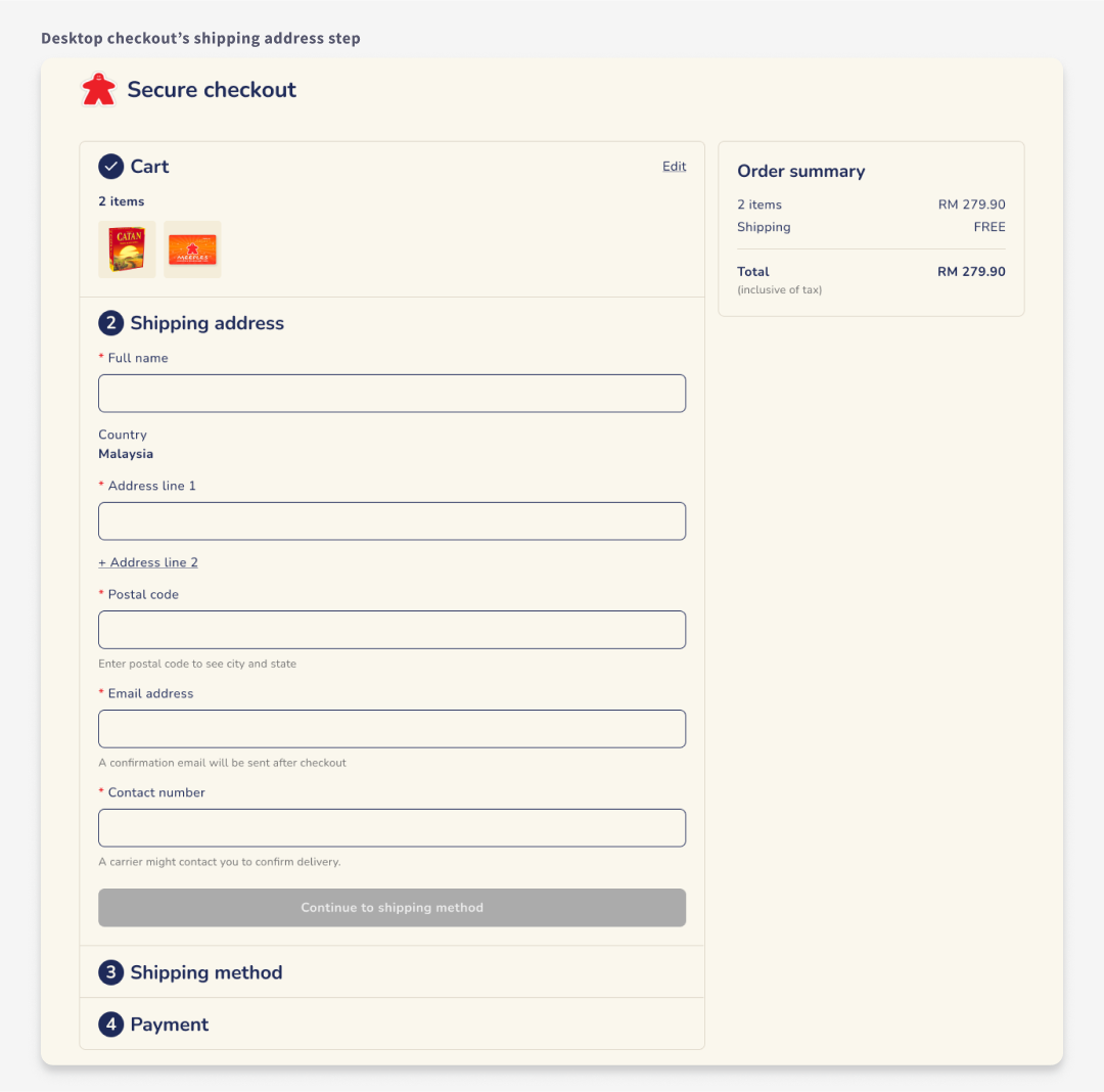
Simplified checkout

An enclosed checkout design has been used by removing all the extraneous promotions on either side as well as simplifying the header . This allows users to focus better on the actual checkout process and prevents users from accidentally exiting the checkout.

Only essential form fields required for shipping address are shown by default. This is achieved by combining the first and last name field, collapsing address line 2 behind a link and only showing city and state field after postal code has been entered. As a result there’s almost a 60% reduction in form fields, making users feel more at ease when seeing the checkout form.

Checkout steps have been presented upfront so that users can know how far along they are in the checkout process and easily navigate between steps.